Wednesday, October 22, 2014
Shaded Relief
This site (http://www.shadedrelief.com/ ) is an excellent source of information, images, and trends in shaded relief and mapping physical environments. I highly recommend you check it out!

Tuesday, October 21, 2014

Lab due dates
Lab 6: Color -- due at the END of lab today (Tues Oct 21)
Lab 7: Proportional Symbol -- due Tuesday Oct 28 at the start of lab
Lab 8: Isarithmic Map -- due Thursday Oct 30 at the start of lab
Yes, there is overlap...but you still have a week to complete each one.
Lab 7: Proportional Symbol -- due Tuesday Oct 28 at the start of lab
Lab 8: Isarithmic Map -- due Thursday Oct 30 at the start of lab
Yes, there is overlap...but you still have a week to complete each one.
Final Project Examples from the past
Here are links to many final projects from GGS310 in the past (and a graduate Thematic Cartography course). I will continue to collect more to show you.
http://ggs310.posthaven.com/final-project-maps-from-a-graduate-class-in-s
http://ggs310.posthaven.com/final-projects-from-2-3-years-ago
http://ggs310.posthaven.com/and-more-45
http://ggs310.posthaven.com/final-projects-from-fall-2009
http://ggs310.posthaven.com/final-project-maps-from-a-graduate-class-in-s
http://ggs310.posthaven.com/final-projects-from-2-3-years-ago
http://ggs310.posthaven.com/and-more-45
http://ggs310.posthaven.com/final-projects-from-fall-2009
One more thing to think about with your final project
There are two map competitions for college students (one sponsored by National Geographic and one by CaGIS). Your final project map could certainly be designed to be entered into one (or both) of these.
Details: http://www.natgeomaps.com/mapawards.html
Also you should look at NACIS (North American Cartographic Information Society). They have their own competitions and are more at the forefront of mapping that any other oganization: http://nacis.org/
Also you should look at NACIS (North American Cartographic Information Society). They have their own competitions and are more at the forefront of mapping that any other oganization: http://nacis.org/
Final Project Proposal Presentation
In addition to the written proposal posted to your blog, I'm having everyone give a quick presentation of the topic you will be mapping. The goal is to gather lots of resources and feedback right from the start.
For the presentation: No powerpoint needed. Show us your blog and paraphrase your proposal. If you are inspired by an online map, show us! Explain how yours will be different/better/more detailed, etc. If you cannot find a site online similar to your idea, find an example of the style of map you want to create as a visual reference point. Make sure you have at least one map to show that connects in some way to your proposal.
Presentations will be on the same day as the proposal-- Tuesday Nov 4th
Final Project Topic and Proposal
For the topic, think of something interesting, something that could link up with a project for a different class (I'm ok with double-dipping), or just something you've been curious to see as a map. Anything goes -- any topic is fair game (well, provided it won't get me in trouble).
Single variable maps are the easiest (and what I recommend). I will, however, let you make a bivariate map (2 datasets). Three or more datasets on one map are prohibited for this project (they get logarithmically more complex). Just one word of caution on bivariate: don't get caught up trying to answer a question with the map (i.e. don't think of this as a GIS project where you need a map to show a result). For this class, the *map* is the key component. Doesn't matter if the topic has been done before, just so long as your map is fantastic. Focus your energy on the graphic not the data.
In order to make the map you must have data. Really search for the data before you settle in on your topic. This is often the "make or break" step of an idea. If there is a topic you love but can't find any data, let me know and I'll do some sleuthing as well. And Joy Suh, the Geography-oriented librarian at Fenwick library is also an excellent resource (for both data and ideas). I recommend seeing her if you are stumped. One last approach is to find a bad map of interesting data, and set about making it better (much, much better).
To help you nail down your idea (and communicate it to me) I want your to write a proposal. It needs to be a well-written blog post of around 500 words covering the following points:
-map subject
-reason why this is your pick
-map audience
-type of map you're envisioning
-scope of map (world? Virginia? Dorm room?)
-data specs (note where the data is from, the year, the size/complexity of the dataset, and the apparent accuracy)
-basemap needed for map
-expected production steps (be realistic and calendar focused)
-challenges you perceive
***The Final Project Proposal is due Tuesday Nov 4th at the start of lecture*** You must have it posted to your blog by then. If you have any questions, I'm more than happy to hear your ideas. Fire away!
Friday, October 17, 2014
Weekly Blog Map #7: Proportional Symbol
Ok...you know the drill. Find a map online that is a well crafted example of a proportional symbol/graduated circle map. Any topic. Any symbol (geometric or mimetic).
Graduated Symbols

Neat graduated circle map projecting US pop in 2050 with graduated circles emphasizing major urban centers: http://www.america2050.org/images/2050_Map_Megaregions_Influence_150.png
Very nice interactive map from NYTimes of Immigration data from 1880. Has both choropleth and graduated circle variations: http://www.nytimes.com/interactive/2009/03/10/us/20090310-immigration-explore...
Visualizing the US power grid (note the isoline version as well): http://www.npr.org/2009/04/24/110997398/visualizing-the-u-s-electric-grid
World population: Not the snazziest symbols, but I bet you like the 2.5D aspect: http://thematicmapping.org/api/symbolimage.php
And to be topical, here are two Ebola maps with graduated symbols: http://www.washingtonpost.com/blogs/wonkblog/wp/2014/10/15/understanding-the-ebola-epidemic-in-2-charts-and-2-maps/
Visualizing the US power grid (note the isoline version as well): http://www.npr.org/2009/04/24/110997398/visualizing-the-u-s-electric-grid
World population: Not the snazziest symbols, but I bet you like the 2.5D aspect: http://thematicmapping.org/api/symbolimage.php
And to be topical, here are two Ebola maps with graduated symbols: http://www.washingtonpost.com/blogs/wonkblog/wp/2014/10/15/understanding-the-ebola-epidemic-in-2-charts-and-2-maps/
Thursday, October 16, 2014
Lab 7 Example Maps

Above: Well done. Great legend. Nice size range and crisp identifiable symbol (but you get to use color!)

Above: Creative legend! Nice use of drop shadows (which help with figure/ground contrast). To apply the drop shadow you will need to "group" your counties first. This defines the outside of the whole state as the boundary to receive the shadow. Otherwise you may get internal shadows on some of the counties which looks odd.

Above: very nice example. Good symbol and legend. Rotated with north arrow.

Above: Another good example. Also rotated with small north arrow.

Above: This student really pushed the design! Unique legend and background.

Above: more complicated dataset (diverging). Also uses a photo as the background.

Above: Nice icon. You can always start searching for a "vector" image -- you may get lucky. If you only find raster examples (and aren't keen on hand crafting one in Illustrator) bring in the raster version and trace vector linework on top of it. Then delete the original raster ("white box") version.

**Class Cancelled Today!**
**Today's class and lab (Thursday Oct 16th) are cancelled**
I apologize for the late notice but I just don't feel well. I got up and showered and figured I'd improve but I haven't. :(
So…Lab 6 will be pushed back to the END of lab next TUES 10-21. I will try to drop off the graded Lab 5's to the GGS student lab tomorrow so you can pick it up and see if any changes need to be made.
We were supposed to begin Lab 7: Proportional Symbol today. I will push that back, too. Will send out notice later when I figure it out. I will also update the class calendar.
If you see any classmates, please tell them! I don't want to miss anyone.
-Professor Hallden
Monday, October 13, 2014

Notes on Lab 6: Color
1. The lab write-up states that your neatline must have a background that is something other than white or black...but I'm guessing some of you are not reading the instructions all the way through. So to be blunt: put a colored fill in your neatline (and yes, you need a neatline!). I did say in lab that I'd accept black (which I can't take back), but I absolutely do not want white. Selecting a color that complements your map and does not compete for attention is a trial and error process I want you to work through. Lab 6 shouldn't be a super quick gray-to-color switch. It is a DESIGN lab.
2. I demoed the ColorBrewer utility in lab on Thursday and if you're keen on bringing the colors right into Illustrator I have good news: Rob figured it out! Export your chosen color ramp from the ColorBrewer as an Adobe Illustrator Swatch Exchange File. In Illustrator, go to the Swatches panel. The bottom left corner has a button (library button) -- click on it. Select at the bottom "Other library..." and search to find where ever Windows saved your Adobe Illustrator Swatch Exchange File. It should come right into your Swatches panel! (though if you change computers I'm not sure if it will stay with your lab file or will need to be reattached)
3. Lab 6 is due at the END of lab on Thursday so you have time to make corrections to anything in your graded Lab 5. I may be able to get the graded lab 5's dropped off in the GGS student lab before Thursday....I'll let you know.
2. I demoed the ColorBrewer utility in lab on Thursday and if you're keen on bringing the colors right into Illustrator I have good news: Rob figured it out! Export your chosen color ramp from the ColorBrewer as an Adobe Illustrator Swatch Exchange File. In Illustrator, go to the Swatches panel. The bottom left corner has a button (library button) -- click on it. Select at the bottom "Other library..." and search to find where ever Windows saved your Adobe Illustrator Swatch Exchange File. It should come right into your Swatches panel! (though if you change computers I'm not sure if it will stay with your lab file or will need to be reattached)
3. Lab 6 is due at the END of lab on Thursday so you have time to make corrections to anything in your graded Lab 5. I may be able to get the graded lab 5's dropped off in the GGS student lab before Thursday....I'll let you know.
Friday, October 10, 2014
Lab 6: Color Examples from the past

Very creative approach (above)


Look at how the legend was designed (above)

Very distinctive approach (above)

The map above is a great example -- looks professional. Note the sideways legend. The tan background she selected works with many different color schemes.

Creative legend (missing scale)


Nice color pairing for figure/ground (above)

Note the small style additions to an otherwise standard map (you have to add scale, though).
Thursday, October 9, 2014
Weekly Blog Post #6: Color
Pick and post a map that uses color in a creative, effective way. Any topic, any style. Find something that you feel is really well crafted!
Wednesday, October 8, 2014

Color and Culture
This is an interesting graphic illustrating the cultural connections of color across the globe: http://visual.ly/what-colors-mean-different-cultures
Color, color, everywhere!
The ColorBrewer is fantastic for color classification schemes, but they aren't necessarily the best for the overall color palette of the graphic. I consistently find professional looking maps have colors that harmonize.
Not sure where to start? Here are 2 sites for color inspiration and palettes: Kuler and ColourLovers Both sites have loads and loads of color combinations and use descriptive tags to describe the colors. Need a color to represent "happy?" Type it is as a keyword and see what others think. The sites themselves are also nice examples of design -- good layouts, interesting use of fonts and the like. Check them out...maybe they will inspire you.
And the very interesting Flickr color pickr
Even shopping sites use color as a tool: Etsy color searcher
Color Deficiency
Info on the 3 variations: http://www.iamcal.com/toys/colors/
Wiki page: http://en.wikipedia.org/wiki/Color_blindness
Wiki page: http://en.wikipedia.org/wiki/Color_blindness
Another test: http://www.color-blindness.com/color-blindness-tests/
Good site for general info and links: http://www.toledo-bend.com/colorblind/Ishihara.asp
Color Brewer
I strongly recommend using ColorBrewer for your color maps. It is a great launching point for both sequential (quantitative) and qualitative schemes. You can always modify the color ramps in Illustrator...but these are proven and safe.
Here is another color websites: http://colorschemedesigner.com/

Monday, October 6, 2014
Reminder: Exam 2 tomorrow (Tuesday, Oct 7th)
Bring a pencil, eraser, and simple calculator. A colored pencil could be helpful but is not required.
After the exam you are free to go. Tues/Thurs lab folks will meet at noon!
After the exam you are free to go. Tues/Thurs lab folks will meet at noon!
Image on the National Mall
Artist creates a giant composite face through variations in the landscaping. Situated along the reflecting pool. Another graphic.
Thursday, October 2, 2014
Aral Sea imagery
Watch the Aral Sea slowly disappear...
Sad to think is was the 4th largest lake in the world.
Sad to think is was the 4th largest lake in the world.
Notes on Lab 5: Gray Choropleth maps
-Although the writeup points you to the Census site for data, I will allow you to find data from ANY source provided it is quality data. It *must* be the correct style of data (no total counts!).
-One significant figure it typically enough detail in your legend.
-Examine the decimal level (if you have it) when selecting the natural breaks. Your best breaks may be between 2.3 and 2.9 instead of between 2 and 3.
-For your non-Natural Breaks map, equal interval and quantiles are very easy. Your pick!
-Grayscale. No color!
Tues/Thurs lab: I forgot to talk about DC. For cultural data, the District is often a particularly interesting value (think homicides, education, etc) and so there is a desire to include it on the map. The challenge lies in the size -- it is essentially one pixel. Just not visible. In order to read the value we have to create an inset off to the side. My suggestion is to make a small box and fill it with the appropriate tint. Add a DC label near the box. Perhaps a line pointing to DC. Then your map reader will be able to see the value for the District.
BUT, you do not have to include DC. This lab is the 50 states. You may elect to just skip the District. Your choice. (if you do skip DC, make sure your data classes skip the value as well!)
-One significant figure it typically enough detail in your legend.
-Examine the decimal level (if you have it) when selecting the natural breaks. Your best breaks may be between 2.3 and 2.9 instead of between 2 and 3.
-For your non-Natural Breaks map, equal interval and quantiles are very easy. Your pick!
-Grayscale. No color!
Tues/Thurs lab: I forgot to talk about DC. For cultural data, the District is often a particularly interesting value (think homicides, education, etc) and so there is a desire to include it on the map. The challenge lies in the size -- it is essentially one pixel. Just not visible. In order to read the value we have to create an inset off to the side. My suggestion is to make a small box and fill it with the appropriate tint. Add a DC label near the box. Perhaps a line pointing to DC. Then your map reader will be able to see the value for the District.
BUT, you do not have to include DC. This lab is the 50 states. You may elect to just skip the District. Your choice. (if you do skip DC, make sure your data classes skip the value as well!)
Weekly Blog map #5: Choropleth Map
There are loads and loads of examples out there. Find one that you feel is particuarly interesting and well done (any topic). Keep it static. (note: if you search for "choropleth map" you may find mostly student maps -- no one names their map by the style unless assigned for a class). :)
Choropleth Maps
U.S. Population Density when the 300 million mark was met (an unclassed map): http://earthobservatory.nasa.gov/IOTD/view.php?id=7052
The United States of Mind (go to the Interactive Map): http://online.wsj.com/article/SB122211987961064719.html?mod=yhoofront#project
Gas Price Map: http://www.gasbuddy.com/gb_gastemperaturemap.aspx
Electoral Shifts from 2004: http://www.nytimes.com/interactive/2008/11/05/us/politics/20081104_ELECTION_R...
Life Expectancy Across the US: http://www.washingtonpost.com/wp-srv/special/nation/life-expectancy-map/
US Population and Growth Trends: https://blogger.googleusercontent.com/img/b/R29vZ2xl/AVvXsEg-CKEoOuhLTEQ3vca3MLZYtZi8s1hoC9-SKqmwXv_uNPPNZMNmDDC9l60IpaWcnPyftfJ_RyXXPJQoe6-5_pCK3ztumW2Ar_ysYrLKUoBuwYkQmrzTzgFBHwZDf2-wvgvehUi1hm2qshF9/
Increasing Girth Rate: http://www.washingtonpost.com/wp-dyn/content/graphic/2010/09/20/GR20100920068...
Census Data in US since 1990: http://www.washingtonpost.com/wp-srv/special/nation/census/2010/
Monday, September 29, 2014
Lab 4 Notes
1. Selecting and copying your boundary from one Illustrator file to another.
Even though we exported the boundaries as "ai" files, they have levels of grouping applied from ArcMap. When you initially open one of your files from ArcMap and click the boundary (on the line work), the entire page is highlighted (not just the boundary outline). Double click on the boundary again. Note that the top of the window now shows a "group" subclass (this what I refer to as grouping applied in ArcMap). The conversion from shapefile to AI leaves these artifacts. In order to get to our boundary for copying (or any modification), we need to go through a process of clicking to get through the layers of grouping.
Double click twice more to get to the Clip Group level. Now you should be able to single click and highlight nodes and lines. Holding shift, click to select any remaining pieces. Now you can copy and paste the boundary into your fresh new Illustrator lab 4 document (on its own labelled layer).
This process of clicking and double-clicking will be a recurring issue when using our ArcGIS generated boundaries. I am trained to double-click until the arcs and nodes become highlighted. Then I can tinker.
The gray bar at the top of the window that shows the levels of grouping also has an arrow on the left side. Clicking the arrow will take you back up the levels of grouping. You may need to do this if you click beyond the "Clip Group" level (into the Compound Path). The arrow will also just take you back to a normal state.
2. Stuck on Part 1? Here's one approach...
Open ArcMap. Go to File -> Add data -> Add Data from AcrGIS Online.
Find USA Counties Generalized. Click Add. It will take a moment but will appear on the screen.
Go back to Add Data from ArcGIS Online and add USA States Generalized (scroll down to find it).
Now you need to select out just the parts you want (VA, MD, DC and the counties of VA and DC). There are many ways to do this. Here is one way that seems simple.
Zoom into the east coast.
Starting with the states: click on the Sublayer "USA_States_Generalized" to highlight it. Go to Selection (top menu bar) -> Interactive Selection Method -> Create New Selection. Use the cursor to click on the states that you want to select including DC. Then create a new layer with just your selected items (right-click on the highlighted sub-layer, choose Selection -> Create Layer from Selected Features). A new layer (likely in purple) called "USA_States_Generalized selection" will appear in the left column.
Now we can grab out the counties in VA and MD using the new layer of just "selected" states. Go to Selection at the top -> Select by Location. In the popup window set "USA_Counties_Generalized" as the "select feature from" part. Set the Source layer to "USA_States_Generalized selection." Click apply. This will give you all of the counties (plus the ones on the perimeter of the states). To delete those unwanted counties go back to top menu: Selection -> Interactive Selection Method -> Remove from current selection and click on the ones you don't want. When you are down to just the counties in VA and MD, right-click on the USA_Counties_Generalized, choose Selection -> Create Layer from Selected Features. A new layer (likely in purple) called "USA_Counties_Generalized selection" will appear in the left column.
At that point you will have 2 created layers that only have the content you want: one for states and one for counties. Hide everything except for the selected states layer and proceed with the Export steps in the writeup. Then hide the states and make the selected counties visible. Export it as a separate file following the writeup. Proceed to Illustrator and verify that the boundaries worked. If so, you're set!
2. Stuck on Part 1? Here's one approach...
Open ArcMap. Go to File -> Add data -> Add Data from AcrGIS Online.
Find USA Counties Generalized. Click Add. It will take a moment but will appear on the screen.
Go back to Add Data from ArcGIS Online and add USA States Generalized (scroll down to find it).
Now you need to select out just the parts you want (VA, MD, DC and the counties of VA and DC). There are many ways to do this. Here is one way that seems simple.
Zoom into the east coast.
Starting with the states: click on the Sublayer "USA_States_Generalized" to highlight it. Go to Selection (top menu bar) -> Interactive Selection Method -> Create New Selection. Use the cursor to click on the states that you want to select including DC. Then create a new layer with just your selected items (right-click on the highlighted sub-layer, choose Selection -> Create Layer from Selected Features). A new layer (likely in purple) called "USA_States_Generalized selection" will appear in the left column.
Now we can grab out the counties in VA and MD using the new layer of just "selected" states. Go to Selection at the top -> Select by Location. In the popup window set "USA_Counties_Generalized" as the "select feature from" part. Set the Source layer to "USA_States_Generalized selection." Click apply. This will give you all of the counties (plus the ones on the perimeter of the states). To delete those unwanted counties go back to top menu: Selection -> Interactive Selection Method -> Remove from current selection and click on the ones you don't want. When you are down to just the counties in VA and MD, right-click on the USA_Counties_Generalized, choose Selection -> Create Layer from Selected Features. A new layer (likely in purple) called "USA_Counties_Generalized selection" will appear in the left column.
At that point you will have 2 created layers that only have the content you want: one for states and one for counties. Hide everything except for the selected states layer and proceed with the Export steps in the writeup. Then hide the states and make the selected counties visible. Export it as a separate file following the writeup. Proceed to Illustrator and verify that the boundaries worked. If so, you're set!
Friday, September 26, 2014
Lab 4 Examples


Scale shouldn't say "equals"

Thursday, September 25, 2014
Weekly Blog Map #4: Campus Map
This week we are discussing graphic design. In that regard, I want you to find a campus map that is exceptionally well designed (any college or university anywhere). Higher education is a business and smart ones use their map as an additional marketing tool. They incorporate trees and creeks and natural elements in addition to buildings and parking lots. Find a map that makes a compelling case to you based solely on the map they present.
Tuesday, September 23, 2014
Graphic Design
The Sad Tally: Suicides on the Golden Gate Bridge:
Map of Parking Tickets in NYC: http://tinyurl.com/5e9b4s
Total Solar Eclipse Paths: http://www.flickr.com/photos/michaelpaukner/4429654194/sizes/o/
Web Comic: http://xkcd.com/503
World Population shown by latitude and longitude: http://urbandemographics.blogspot.com/2010/08/world-population-distribution-m...
What your global neighbors are buying: http://www.nytimes.com/interactive/2008/09/04/business/20080907-metrics-graph...
Stylized Typography city maps: http://store.axismaps.com/
Election redistricting (good use of graphics within lots of text): http://www.nytimes.com/interactive/2010/09/26/weekinreview/26marsh.html
A bit of map art: http://bldgblog.blogspot.com/2010/03/new-world-order.html
Collections of good graphics (many of which are geographic):
Monday, September 22, 2014
Census 2000 Maps
Throughout the semester I am going to refer to a set of maps made by the Census Bureau (with the help of Cindy Brewer at Penn State) based on 2000 census data. It is a well constructed composition of maps that display a wide range of thematic data using several different symbologies.
The pages take a bit to load (as pdfs) but the quality is excellent. You can use them as a reliable source. Look at them closely. How do they deal with noncontiguous entities? How do they classify the data? Look at layout, figure/ground, legend design, basemap, etc.
Thursday, September 18, 2014
Lab 3: Harpers Ferry Map -- Important Info
So...you've been working diligently on your lab -- mimicking the labels from the master printout. You go to print it out (to check your placements and sizes and colors) and find it is smaller than the master print. And when you Save for the Web...it is much smaller.
What should you do?
Hand in the map at 100% size (no scaling) in color with a landscape orientation (which can be set in the printing window). I will grade the printed size and understand the corresponding difference in font size. With 31 maps to grade, I will quickly learn the target size.
For the blog copy, use the normal Save for Web... You may have to use the Hand tool to move the map into the visible window. Try deselecting the "Clip to Artboard" button. Save as PNG-24. That should suffice for the blog.
Questions? Post a comment to this post.
What should you do?
Hand in the map at 100% size (no scaling) in color with a landscape orientation (which can be set in the printing window). I will grade the printed size and understand the corresponding difference in font size. With 31 maps to grade, I will quickly learn the target size.
For the blog copy, use the normal Save for Web... You may have to use the Hand tool to move the map into the visible window. Try deselecting the "Clip to Artboard" button. Save as PNG-24. That should suffice for the blog.
Questions? Post a comment to this post.
Weekly Blog Map #3: Type
This week find a map that uses type in an effective or creative way. There are some art maps out there that take the symbology of type to the extreme, but there are loads of examples of "normal" maps that are elevated by interesting uses of text. Either style will do. Search around and find an example no one has posted! Include a link to the original site and a sentence explaining why it is your pick.
TypeBrewer
A new Typography tool for Cartographers has been created: TypeBrewer http://www.typebrewer.org/
It is a content-rich Flash applet that lets you view the effect of different fonts on a particular map. It gives you the ability to modify the font, try different fonts, even upload your own fonts. There are also extensive notes about the different styles and guides on usage. It is nicely done and I encourage everyone to use it as a guide.
It is a content-rich Flash applet that lets you view the effect of different fonts on a particular map. It gives you the ability to modify the font, try different fonts, even upload your own fonts. There are also extensive notes about the different styles and guides on usage. It is nicely done and I encourage everyone to use it as a guide.
Type

This is the week we explored typography. One of the best parts of type is the variety -- how the simple shift to a different font can make a dramatic visual change to your map. In lecture, I mention the web as a source for so many interesting free (non-copyrighted) fonts. My favorite site is dafont.com: http://www.dafont.com/ It has such variety --I can waste some good time just browsing through them. But you have to be careful using some of the specialty fonts: several fonts do not have a complete set of characters and numbers (which you might really need) and many are just too flashy/busy for a map. Titles often accept more flourishes, but keep it clean for labels. The other big warning is that if you are using someone else's computer, you might not be able to install the fonts. Major bummer.
Here are a few other note-worthy font sites:
Urban Fonts: http://www.urbanfonts.com/
1001 Fonts: http://www.1001fonts.com/
Search Free Fonts: http://www.searchfreefonts.com/
If you have a favorite site you use, post a comment with a link. A longer list would be awesome....
Here is one (of a few websites) for typography enthusiasts: http://ilovetypography.com/
Info-graphic on serif vs san serif: http://visual.ly/serif-vs-sans-final-battlehttp://visual.ly/serif-vs-sans-final-battle
And a new graphic for helping you find what font to use: http://inspirationlab.files.wordpress.com/2010/04/infographiclarge_v2.png
Lastly..."What Type are You?" courtesy of Pentagram: http://www.pentagram.com/what-type-are-you/
Wednesday, September 17, 2014

Monday, September 15, 2014
Reminder: Exam 1 on Tuesday
Just a friendly reminder that Exam 1 is this Tuesday, Sept 16th. A review sheet is on Blackboard (and read the post below about one additional bullet point). I will supply the paper -- you need a pencil, an eraser, and a calculator.
For those in the Tues/Thurs lab section, we will have lab after the exam. You may exit once you turn in your papers but come back at noon. Lab 2: Graticule is due on Thursday. We will have time to work on it during lab on Tuesday.
For those in the Tues/Thurs lab section, we will have lab after the exam. You may exit once you turn in your papers but come back at noon. Lab 2: Graticule is due on Thursday. We will have time to work on it during lab on Tuesday.
Thursday, September 11, 2014
One more thing for the Exam on Tuesday...
I'm working on Exam 1 and realized I forgot one bullet point on the review sheet. I want you to know the Spatial Arrangement graphic in the Symbolization lecture. It covers continuous/discrete vs. abrupt/smooth. Familiarize yourself with the axes and also what maps you get in the four corners of the graphic. They are the 4 major thematic map styles.
Polyhedral Maps in Paper
My favorite site on Projections also has templates for crafting your own tangible paper earth. If you print one out, assemble it, and bring it into class I will give you 5 extra credit points. Slightly thicker paper might be easier...but with any of them you'll need scissors and a glue stick.
Scale
Scale is easy on general terms, but grasping relationships over large distances or at the nano level can be challenging. Today we are going to discuss scale, learn to calculate it for our maps and view visualizations.
Here are 12 unique ways to view scale: http://blog.visual.ly/12-visualizations-that-will-change-the-way-you-view-scale-in-your-world/
xkcd (again).
This page has a good explanation of calculating the three major types of map scale and switching between them. You will need to be able to do simple scale calculations and conversions for Tuesday's Exam 1.
Here are 12 unique ways to view scale: http://blog.visual.ly/12-visualizations-that-will-change-the-way-you-view-scale-in-your-world/
xkcd (again).
This page has a good explanation of calculating the three major types of map scale and switching between them. You will need to be able to do simple scale calculations and conversions for Tuesday's Exam 1.
Exam reminder
Tuesday 9-16 is the first exam of the semester. A review sheet can be found on Blackboard. The exam will be held during the lecture block (10:30-11:45). We *will* have lab time starting at noon (for the T/Th lab folks). Please bring a pencil, eraser, and calculator. A ruler will not be needed. I will provide all of the paper.
Tuesday, September 9, 2014
Illustrator in Exploratory Hall 2102
Illustrator is on the first 16 machines in the student GGS lab. If you use one of those computers, you should be able to print directly from Illustrator (after accepting the warning about a different software version).
Saving Between Different Versions of Illustrator
We have the CC (Creative Cloud) in the classroom. The GGS student lab (2102) has CS6 (prior version). You can move from an older version to a newer at any point. But moving from new to old is not always easy. If you expect you'll be moving around, choose to save as a Legacy version.
Legacy Formats -- Save As... Give it a name and click Save, then it will bring up an Illustrator Options Panel where it is set to Illustrator CC. Pull down that top pull down window and you can specify CS6.
Weekly blog post #2: Projection
We skipped last week...but that's ok! For this week, find a quality map example that showcases the projection or uses a unique projection to highlight the phenomenon being mapped. Any topic, any style. Post a copy of the map to your blog along with a link to the original webpage. Add a sentence or two explaining why you selected it. Aim to find one no one else has selected!
Monday, September 8, 2014
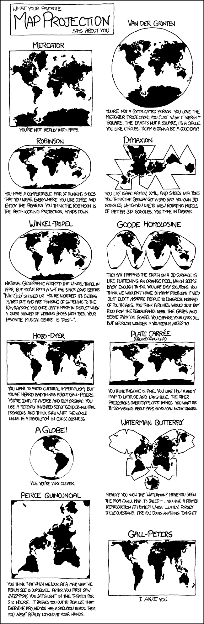
Projections
Nice video of myriahedral projections
My favorite site for information on map projections. Lots of graphics (ones that I did not show in class) and in-depth descriptions. Worth checking out: http://www.progonos.com/furuti/MapProj/Normal/TOC/cartTOC.html
Love this map! So much information but still clear. Many different projections: http://urbanomnibus.net/main/wp-content/uploads/2009/03/arcticmap.jpg
My favorite site for information on map projections. Lots of graphics (ones that I did not show in class) and in-depth descriptions. Worth checking out: http://www.progonos.com/furuti/MapProj/Normal/TOC/cartTOC.html
Nice example of a projection selected to accommodate the phenomena: http://www.washingtonpost.com/wp-dyn/content/graphic/2009/04/15/GR20090415011...
Another nice projection selection:
http://www.washingtonpost.com/wp-dyn/content/graphic/2011/03/06/GR2011030603876.html?hpid=topnewsLove this map! So much information but still clear. Many different projections: http://urbanomnibus.net/main/wp-content/uploads/2009/03/arcticmap.jpg
Nice explanations of major projections from the National Atlas site: http://www.nationalatlas.gov/articles/mapping/a_projections.html
Freeware program for creating map projections: Flex Projector http://www.flexprojector.com/
Map projections used to create a globe in a different medium: http://weblogs.java.net/blog/kohsuke/archive/2009/06/afterjavaone_pr.html
Just about anything can show the continents: http://kevinvanaelst.com/photoapple.html


Friday, September 5, 2014
Lab 1 notes
When saving your lab, I recommend two versions:
1. An .ai version which allows you to open your file in Illustrator and make changes/corrections. This is very important. You can also use the .ai version for printing if you have both Illustrator and a printer.
2. A .png (PNG-24) version. This version is for Blogger and can also be used for printing (when you do not have Illustrator on the computer). The PNG-24 option is available when you "Save for Web..." All of the defaults are fine.
The Lab 1 instructions say to save your blog version as a .jpg with Maximum quality, but the background of image is appearing as a faint gray. The PNG-24 version is retaining the crisp white background of the page just like in Illustrator.
1. An .ai version which allows you to open your file in Illustrator and make changes/corrections. This is very important. You can also use the .ai version for printing if you have both Illustrator and a printer.
2. A .png (PNG-24) version. This version is for Blogger and can also be used for printing (when you do not have Illustrator on the computer). The PNG-24 option is available when you "Save for Web..." All of the defaults are fine.
The Lab 1 instructions say to save your blog version as a .jpg with Maximum quality, but the background of image is appearing as a faint gray. The PNG-24 version is retaining the crisp white background of the page just like in Illustrator.
Thursday, September 4, 2014
Subscribe to:
Posts (Atom)